As a UX designer deeply invested in the world of apps and user experience, there’s a subject that has been occupying my mind lately—the fascinating interplay between anticipatory, persuasive, and emotional design in UX. We’ve all encountered those products that seem to hold an irresistible allure, effortlessly keeping us hooked. But have you ever wondered how these products leverage psychological techniques to influence our decisions, sometimes even at the cost of our autonomy?
It’s undeniable that our brains have undergone significant remodelling due to our exposure to new information through interfaces. The consequence? We find ourselves becoming less intentional and deliberate, leading to concerns such as addiction and a more polarised society. Famed Silicon Valley investor Paul Graham, points to a crucial reality: “We haven’t had enough time to develop societal ‘antibodies’ to counteract the effects of addictive technologies.”
As designers, one of our key objectives is user retention, which may inadvertently encourage a form of addiction. As users, we are cognitive misers, we are built to minimize cognitive effort and save our critical thinking for when it’s most needed.
The question that tugs at my conscience is this: Where does persuasive UX end and manipulative UX begin? And therefore; how do we achieve long-term user engagement without it being exploitative?
WHAT MAKES PERSUASIVE TECHNOLOGY SO POTENT?
“The fundamental problem of humanity is we have paleolithic emotions, medieval institutions, and god-like technology.”
This intriguing blend, stated by E.O. Wilson, the acclaimed “Father of Biodiversity” presents a fundamental challenge for humanity. While we possess stone-age emotions, our ever-advancing technology has a profound impact on our cognitive limits.
Tech giants often operate with the belief that their role is simply to provide users with what they desire, adopting a seemingly neutral approach towards technology’s influence on society. This perspective permeates the realm of user experience design, shaping the decisions made by designers. However, perhaps it is time for a change in perspective—a shift that goes beyond catering solely to user desires and takes into account the vulnerabilities inherent in being human.
The concept of persuasive technology comes into play here, representing a powerful force designed to tap into our brains and subtly nudge us toward specific behaviors. Maèva Flayelle and colleagues looked into the taxonomy of addictive tactics, such as:
- Personalized triggers: Notifications designed with elements like vibrations, buzzing, red dots, or flashing lights mimic naturally occurring signs of danger, cleverly luring us back into apps for more interaction.
- Reinforcement schedules: Design features such as infinite scroll, that keeps us perpetually engaged. Or the allure of new comments or likes, triggers a compulsive need to constantly monitor for updates, seeking feelings of pleasure and reward.
WHY SHOULD YOU CARE?
As UX designers, we might not be able to influence how and when new technologies are deployed to the public, but by understanding the workings of our brains, we can influence the velocity of adopting new apps and perspectives. The experience we craft can make a simple or complex contagion.
According to Timothy Wilson, our five senses are bombarded with around 11,000,000 pieces of information at any given moment. Yet, our conscious mind can only process 40 of them. To manage this overwhelming influx of information, the “bouncer in the brain” decides what to allow into our conscious awareness. Activity in this region is inversely correlated with unnecessary storage, filtering out information deemed less important.
In this attention economy, a series of invisible nudges manage to bypass our conscious minds and directly access our limbic system—often referred to as the lizard brain. This phenomenon is known as a limbic hijack, where our emotions and instincts take precedence over rational decision-making.
Our brains form synaptic connections when we learn something new, creating neural pathways that facilitate more efficient processing. This adaptive mechanism is highly functional for conserving energy and thinking power once an action becomes routine. While advantageous in certain contexts, this “unconscious competence” has also manifested in our digital behavior, leading to mindless scrolling and unproductive habits.
UPGRADING THE UX HOOK
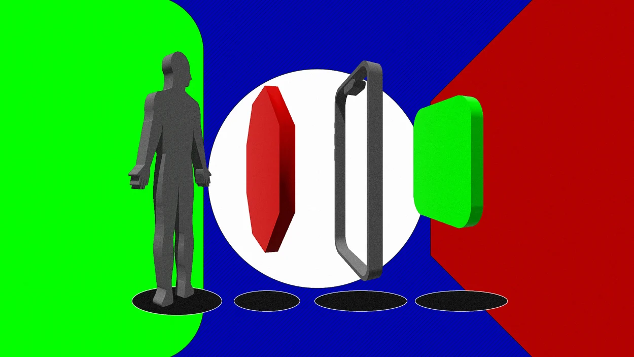
Nir Eyal’s widely acclaimed Hook Model has been a game-changer, providing a framework that connects user problems with designer solutions, fostering long-term engagement. While the model has proven its effectiveness, I propose that there’s a missing piece—a crucial phase: Pre-action.
Before we dive into the pre-action phase, let’s briefly recap the key elements of the Hook Model:
- What do users really want? What pain is your product relieving? (internal trigger)
- What brings users to your service? (external trigger)
- How can you architect the critical path, so that users are mindful? (pre-action)
- What is the simplest action users take in anticipation of reward, and how can you simplify your product to make this action easier? (action)
- Are users fulfilled by the reward, yet left wanting more? (variable reward)
- What “bit of work” do users invest in your product? Does it load the next trigger and store value to improve the product with use? (investment)
PRE-ACTION: WHAT, WHY, HOW
What?
The pre-action phase is essential because it addresses potential vulnerabilities that users may face when engaging with a product. By adding a layer of friction before the user proceeds with their actions, designers can create intentional spaces that promote critical thinking and mindful decision-making.
Why?
In the initial phase of the Hook Model, triggers play a key role. Triggers like external cues (notifications) or intrinsic motives (feeling bored), prompt users to engage with a product. Through repetition, users associate these triggers with the desired behaviour, forming a habit over time.
The digital culture we live in has driven changes in how we engage our brains, creating different brains. Every time we learn a new skill, develop or lose an ability, our brain is modified on a large scale, physically and functionally. This is scientifically known as neuroplasticity and neurogenesis. The more we repeat a specific and heavily exercised task, like falling prey to scrolling bottomless social feeds, our minds strengthen that ability.
It takes a potent cocktail of emotion, bias, and repetition to suppress that critical thinking and create an addictive loop. In the early stages, habit-forming products rely heavily on external triggers to get users’ attention. Through repeated exposure and interaction, external triggers start forming associations with internal triggers — emotions, desires, or needs.
As users continue to respond to these triggers, the connection between the trigger and the desired behavior becomes stronger, leading to the formation of a habit. Pre-action focuses on enabling critical thinking by informing and preparing users before they take an intended action.
How?
Here are few examples of how we can put pre-action into practice and stage intentional UX:
Content customization: Allowing users to shape the content they see based on their interactions feels like we’re returning power to them, but the issue lies in explaining the mechanism, and potential escape routes from this algorithmic power. Efforts are being made to break free from this algorithmic influence, as highlighted by Eli Pariser’s Ted Talk on online “filter bubbles.”
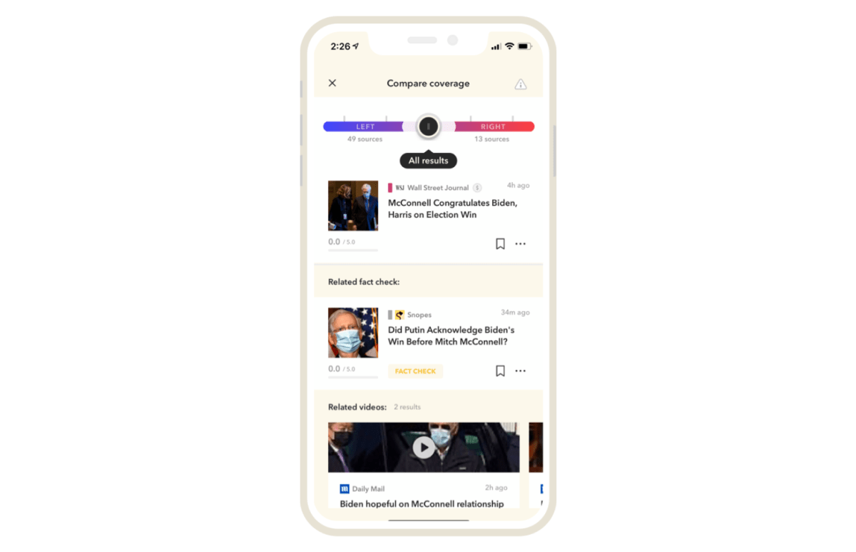
Gawq arranges daily news based on topics, avoiding algorithms or personalisation. While reading, users can click to compare story coverage across sources, understanding different outlets’ perspectives. A slider bar lets users switch between red (right-leaning) and blue (left-leaning) viewpoints for balanced insights.
Opt-out empowerment: Providing the choice to opt out is crucial. This involves creating tools and environments that users can use if they wish, rather than coercively pushing them away.
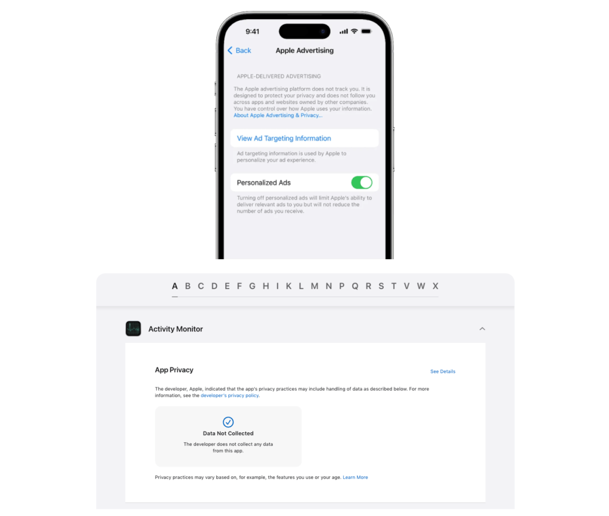
Apple aims to build trust and foster a sense of control over the user’s experience. Not only do they provide options on opting out of personalized ads, but have introduced nutrition labels, that arm users with knowledge of not just how an app is used, but how it’s using them.
Information absorption: Decision hygiene aims to manage information effectively by focusing on acknowledging and addressing noise rather than suppressing it. Just as unseen germs can still harm you, making unwise decisions may lead to future negative consequences.
Progressive disclosure improves three of usability’s five components: learnability, efficiency of use, and error rate. The primary objective is to empower users to comprehend and utilize data for informed decisions. This involves presenting a high-level overview before delving into detailed, specific data points, maintaining a balance between data density and absorption.
While condensing content onto fewer pages aims to reduce clicks, it can overwhelm users and hinder conversions. The goal is to simplify—making information accessible and manageable across multiple pages while ensuring a gradual and seamless transition into deeper content.
Here are two data visualzsation approaches:
- Vertical data density: This method starts with high-level data and gradually reveals deeper details. Dashboards offer insights and highlight areas requiring attention, with additional information available as needed.
- Layered data density: Utilizing design elements like Mega Menus and Hover Controls, this approach presents high-level information initially and progressively unveils more data through interactions like mouse-overs or clicks. This guides users through digestible steps, gradually increasing complexity and effort.
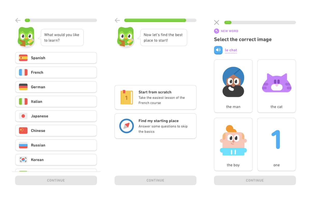
Duolingo uses interactive steps to help users get started as a means to progressively onboard. It encourages users to take a quick language test to understand how the app works.
Challenge of the friction fallacy: The belief that fewer clicks or less user effort is always better may not hold true in situations where users need to process extensive details or make thoughtful decisions. This belief breaks down when applied to complex user journeys. When it comes to what a good nudge is, it is to reinforce better and purposeful choices. It needs to enhance wellbeing and it is not about compulsion.
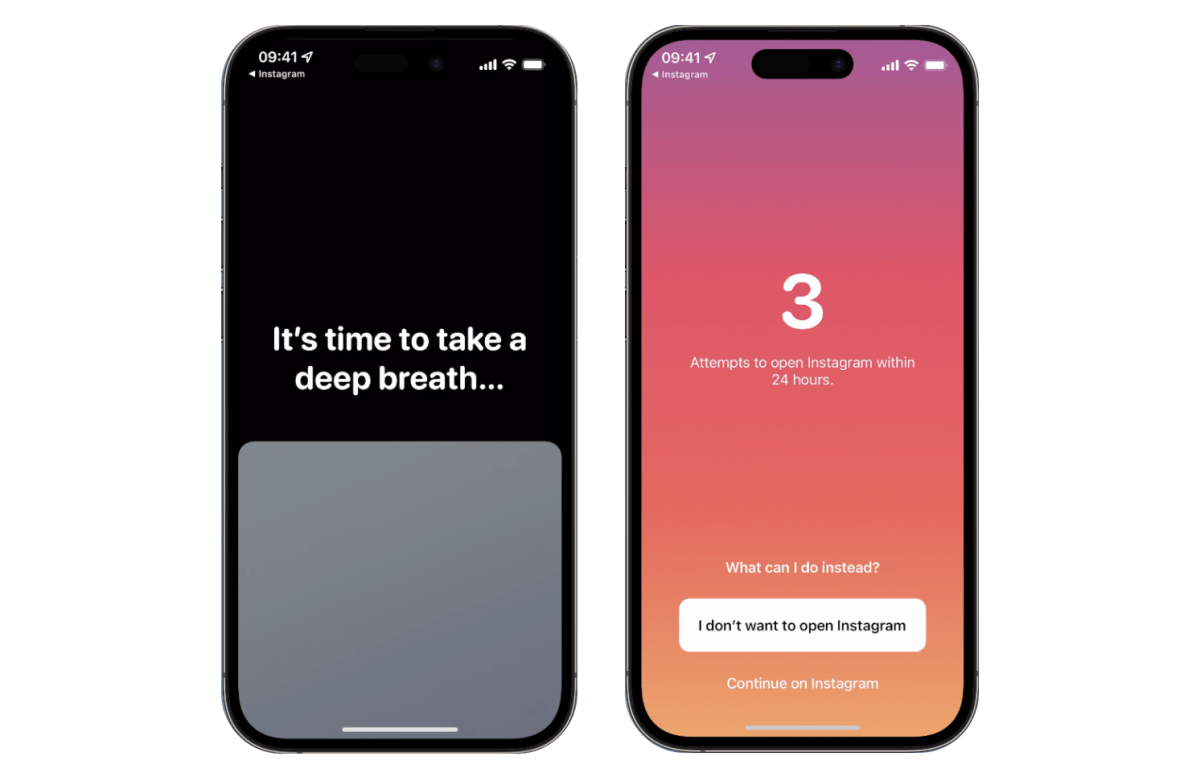
One Sec is an app designed to encourage mindful social media usage. It prompts users to take a deep breath whenever they open social media apps, introducing a moment of pause and reducing the immediate reward of instant gratification. The app’s intervention led to a significant reduction in social media usage, showing a 57% decrease, according to their peer reviewed study.
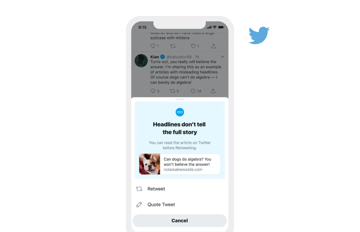
The gap between people’s beliefs and their social media sharing arises mostly from inattention rather than intentional misinformation. Twitter’s (regrettably known as X) echo chambers exemplify how discourse can shape reality. This was an attempt to promote informed discussions with interventions like “read before you tweet.” It achieved:
- More informed tweeting: People opening articles before re-tweeting increased by 33%.
- More reading: People open articles 40% more often after seeing the prompt.
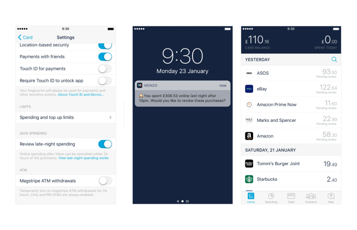
In 2017, the UK-based neobank Monzo had the goal of addressing research findings related to overspending during late-night manic phases. However, Monzo ultimately did not put this feature into action. If they had implemented it, it would have given users either a convenient means to prevent unnecessary purchases or a timely reminder to initiate refunds.
So many digital products have proved that how we engage with a screen can transform how we behave, think and see the world. They’re engineered to be a drug full of reward pathways based on potency, quantity, and variety.
In today’s attention-driven economy, an average person has 40 mobile applications installed, with approximately 18 apps being used 80% of the time. To compete effectively and keep users engaged over the long term, UX designers find Nir Eyal’s Hook methodology valuable. Incorporating the Pre-action phase is important because it addresses potential user vulnerabilities during product interaction.
By introducing a bit of resistance before users take action, designers can create intentional settings that promote critical thinking, thoughtful decision-making, and autonomy, and foster trust in the product.
KEY TAKEAWAYS
- Adding Pre-action to the HOOK model will provide an intentional UX, where users can form opinions and make decisions, but also improve their meta cognitive skills and internet literacy.
- User behavior is influenced by situational factors like group norms, social identities, and social pressures. The same levers are pulled to make the same magic occur through a user interface.
- Decision-making processes should not unfold in such a linear fashion from analysis to action. You should consider implementing obstacles, as users could be making life-affecting decisions as a DAU (daily active user).
__
Guest Author: Emily Yorgey is a UX/UI designer for Modulous and writes for UX Collective.
Seeking to build and grow your brand using the force of consumer insight, strategic foresight, creative disruption and technology prowess? Talk to us at +971 50 6254340 or engage@groupisd.com or visit www.groupisd.com/story