
Designers at media companies, like The New York Times and The Washington Post, helped the public understand COVID-19—and take action to protect themselves and those around them.
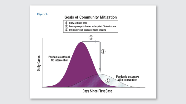
“Flatten the curve”: It was the battle cry of 2020. Though the visual was first published in 2007 by the Centers for Disease Control, this year, it was turned into an animation and shared more than five million times on Twitter, distilling an important public health concept into an at-a-glance graphic. It helped persuade people that the pandemic is real and their individual actions matter.
It’s just one example of how charts, graphs, and illustrations helped us make sense of the chaos and trauma of 2020. In newsrooms and academic settings all over the world, information designers have worked tirelessly to communicate the impact of the crisis and arm the public with critical health information. The result is an impressive output of visualizations that have not only been informative; they’ve helped save lives.
A RICH HISTORY
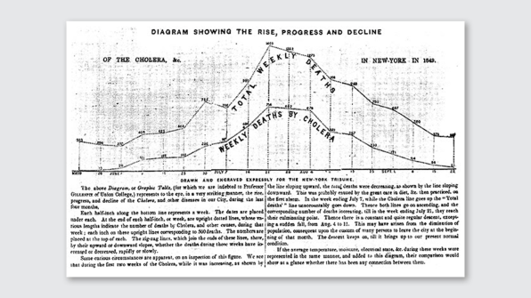
This is not the first pandemic that scientists have turned to visualizations to communicate scale and impact. In 1849, The New York Tribune published a line chart tracking the NYC deaths from the cholera outbreak – a graph with a shape strikingly similar to the “Flatten the curve” graphic. The Tribune graph is one of the first examples of a data visual published to a mass audience. Previously visualizations were occasionally published in scientific research and intended for a scientific cohort. The idea of using a data visualization to communicate the impact of the disease to a mass audience was so novel in 1894 that the line graph was published with a lengthy set of instructions to help newspaper readers understand how to interpret it.
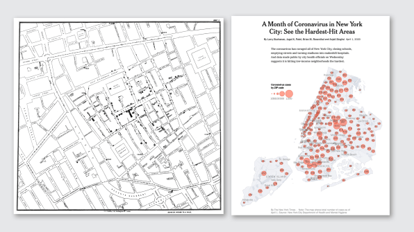
Five years later John Snow, an English physician, introduced the revolutionary idea of using a map to plot outbreaks of cholera. His visual associated occurrences of the infection to a specific geographic location in central London leading to a hypothesis that the Broad Street pump in the SoHo neighborhood was the source of the spread of the contagion. Upon further analysis researchers validated his theory after discovering that the Broad Street public water well was adjacent to a leaking cesspool. Fast-forward 120 years and Snow’s mapping technique, applied in the spring of 2020, led to important discoveries about the dramatic disparity of COVID-19’s impact on different neighborhoods and ethnic populations.
Today, most of the COVID-19 information graphics being published are using familiar visual models including the mapping techniques applied by Snow as well as line, bar, and area charts that Scottish engineer and political economist William Playfair has been credited with inventing in the late 18th century.
What has changed since the visual models of Playfair and Snow is our collective fluency with the visual vocabulary used to tell data stories (no instructions required!). This familiarity coupled with designers’ ability to publish information in real-time and then amplify it across social media has elevated the impact of information design.
USING THE TECHNOLOGY AT HAND
Designers also have access to technology that wasn’t available 200 years ago. They are able to progressively layer an information narrative, using techniques including animation and user-controlled filters and interactivity to create a more nuanced and personalized level of storytelling that was not possible prior to computing.
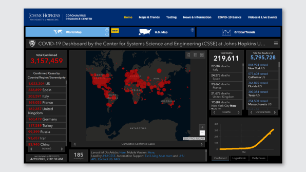
Take the COVID-19 dashboard from Johns Hopkins University of Medicine. Viewers are able to filter a massive data set based on their own inquiries, like how many people have died from COVID-19 or which parts of the world are hotspots. The ease of filtering, combined with the prestige of Johns Hopkins, make it a go-to source of COVID-19 information for many people.
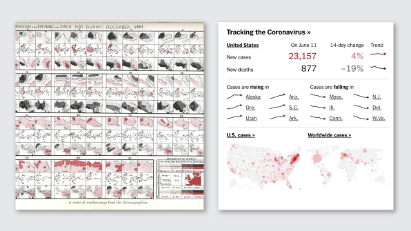
Another example of progressive layering is the New York Times‘s use of sparklines as both an informational and a navigational device. A sparkline refers to extreme compaction of visual information. The term was coined by Edward Tufte in 2006 to refer to word-sized graphics but was a technique first published in the late 18th century. These compact, highly efficient visuals are familiar to many people today in the context of sports and stock chart data. Sir Francis Galton, a British anthropologist, statistician and meteorologist is credited with early use of sparklines for communicating weather patterns over time. His 3-inch-by-3-inch mini-maps published in 1863 reveal patterns of barometric pressure, wind direction, rain, and temperature over a one-month period. In the age of COVID-19, sparklines are being used to not only offer a similarly efficient overview of trends but also act as an invitation into deeper information and data displays, serving simultaneously as an information source and a navigation device.
THE CHALLENGE OF COMMUNICATING SCALE
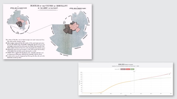
One reason visual representation is used so broadly in telling the story of this pandemic is the challenge of communicating its scale which, as neurological science tells us, is accomplished most effectively and memorably using visual models. Data visualization designers who want to show scale comparisons are faced with a choice of linear or logarithmic representation. Logarithmic display is not a new concept and is ideal for showing relative rates of change or growth. It was first recorded in the early 19th century and was applied in Raymond Pearl’s visualizations of 1919 comparing mortality rates from influenza across U.S. cities relative to their population. With a similar objective in mind, The Financial Times data team applied logarithmic scale to compare death rates attributed to COVID-19 among nations–allowing a comparison among countries of varying populations. The page that includes this chart has become the news website’s most viewed article of all time.
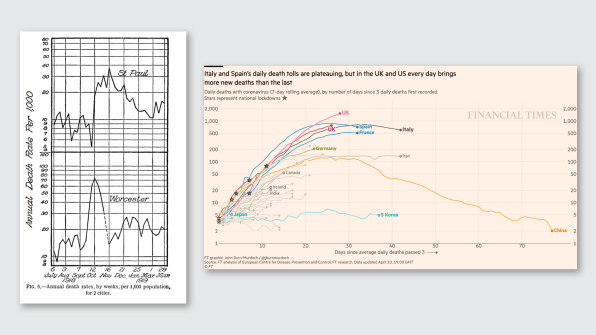
Raymond Pearl, 1919. Right: Financial Times, Coronavirus Tracker. [Images: Raymond Pearl, 1919, Financial Times
In a powerful reversal of the familiar trend of reverting to graphics to tell the story of this pandemic, on May 24, 2020, when U.S. deaths crossed one 100,000 (a milestone that now feels modest), The New York Times listed the names of the deceased in the United States on the front page of its printed edition and the homepage of their digital edition. While long lists of text are typically not our first thought when considering data visualization, the use of text in this context serves to both reinforce the scale–by forcing readers to confront the sheer volume of 100,000 names–and to humanize the crisis by representing those we have lost by their first and last name versus reducing them to a plot point on a graph.
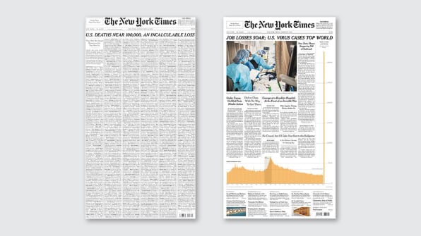
Another innovative application of information design was applied by the New York Times on March 27, 2020 to convey the dramatic peak of U.S. unemployment claims relative to the recent 20-year pattern of Department of Labor claims. New York Times‘s editors unexpected use of the front page right column–a space readers expect to be occupied by text–effectively drew attention to the alarming change in job losses–a change most effectively illuminated with a simple visualization, not unlike those created by Playfair 120 years earlier, but applied in an unexpected context.
HOW DATA DESIGNERS USED METAPHORS
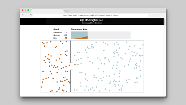
Data visualization is not always about plotting numbers and trends in graphs and charts. One of the most effective visualizations of this pandemic was created by the Washington Post and published in the spring of 2020. The designers applied the familiar metaphor of a bouncing ball to depict the impact of social distancing on the spread of the virus. This simple, illustrative abstraction has resonated with readers and is the most popular online story in the history of the Washington Post–in part because President Barack Obama tweeted it out–but also because it helped readers understand a complex idea.
Another use of illustrative metaphor and one that has proliferated across social media feeds is an animated match-burning video created by Spanish graphic designer Juan Delcan and shot on his iPhone. The short animation uses a familiar model of a spreading flame to demonstrate how the spread can be broken and social distancing can help stop the spread of COVID-19.
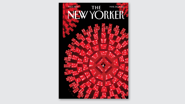
Artist Christoph Niemann applied an equally effective metaphor for his illustration published on the cover of the New Yorker magazine on March 23, 2020. Neiman used the familiar falling domino metaphor composing his dominoes in a spherical format that mirrors the widely known visual illustration of the virus (which the New York Times aptly called that “spiky blob seen around the world”), with a single individual holding a mask at its center.
A TOOL OF INFLUENCE
Data visualization in traditional forms of line charts and bar graphs as well as illustrative metaphors have clearly played a central role in educating the world on the scale and impact of the coronavirus. Visuals have also played an important role in persuading people to act. A data visualization as a tool of influence is also a concept that has historic roots. Florence Nightingale, known for being a battlefield nurse but in fact is one of the first female data scientists, introduced data visualization as a persuasion technique in 1986 by modeling deaths that occurred in hospitals versus on the battlefield. Her “rose chart” was a clear and powerful case for introducing sterilization as standard practice in hospitals. Today visualizations have a similar intent of influence. One example is the University of Washington’s The Institute for Health Metrics and Evaluation (IHME) chart below, which maps outcomes with and without universal adoption of masks in the United States.
By manipulating familiar visual models that have served us for 200 years, and using new visual metaphors and advanced display capabilities, data visualization artists and journalists have played a central role in establishing a shared understanding of the scale and impact of COVID-19. No doubt, they have also persuaded people to act, given the massive reach of their work as it is amplified across social and media channels. This moment marks the ascension of data visualizers at an unprecedented global scale. Let’s hope we look back and thank the information designers for convincing us to do the right thing.
Katherine Dillon is an associate arts professor at NYU Tisch School of the Arts, ITP and IMA Programs.
Guest Author: KATHERINE DILLON
This article first appeared in www.fastcompany.comSeeking to build and grow your brand using the force of consumer insight, strategic foresight, creative disruption and technology prowess? Talk to us at +971 50 6254340 or engage@groupisd.com or visit www.groupisd.com/story