B2B marketers have tried everything under the sun to improve on-page SEO. Using all the keywords. Writing 5,000-word posts. And then going off-page to promote the post to everyone.
But you’re still missing one key ingredient in your on-page SEO optimization: mini-infographics.
With them, your content engages. Without them… not so much.
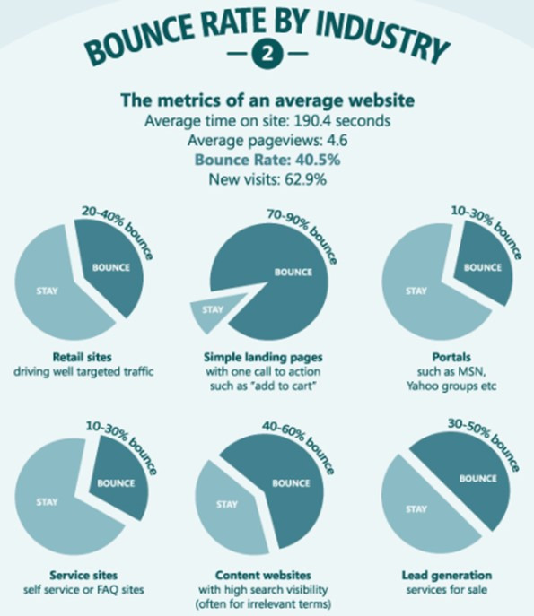
So what does the engagement for all those long posts of yours, as measured by bounce rates, look like?
Here they are by industry:
Marketers need to get creative. Don’t rely on just text to do your work for you. Start creating visuals—specifically, mini-infographics.
Let me explain why.
How Do Mini-Infographics Improve On-Page SEO?
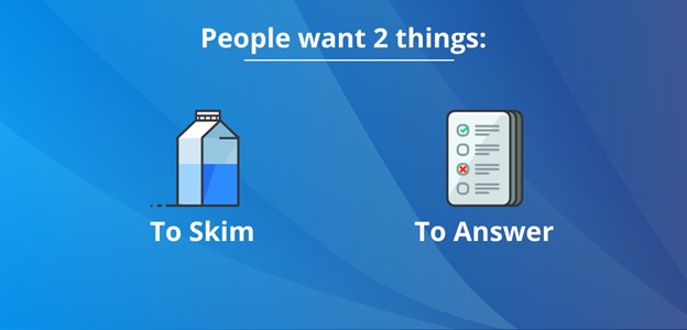
There is one reason why B2B marketers are struggling to retain audiences with their content. Online users don’t want to read that much text. They don’t have the time.
Users want only two things from your content: (1) to skim through it and (2) to find the answer they were looking for.
Source: Venngage
That’s what we learned by conducting a focus group among our B2B customers a few years ago. We showed them two articles that we scrolled through very quickly.
The feedback we received included two major points:
- Text that is divided into headers makes it easier to skim.
- The readers were drawn to articles that included visuals every 100 words or so.
In other words, to reduce bounce rates, you need to change your text-to-visual ratio.
Source: Venngage
That’s because attention spans have been decreasing over the years. If content doesn’t grab a user’s interest within seconds, that person will leave your page.
What’s one of the on-page SEO factors that helps you rank—and reduces bounce rates? Relevant visual content.
You need to shorten the text you write. And to get your message across to your audience, instead of the text you would have used, use more mini-infographics.
How to Design Graphics That Help Your Page Rank on Google
Don’t have a graphic designer on staff? That’s fine, you can always use an online infographic maker. Online platforms offer templates for you to customize.
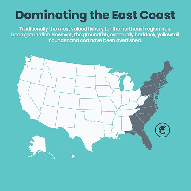
But don’t let more options confuse your goal. This on-page optimization exercise is about creating mini-infographics, like this map:
Source: Venngage
You want to summarize your information and give visitors a reason to move on to the next section of your text. And then the next, and the next, and so on—till they reach the end of the page.
The intent is to encourage more micro-conversions—small steps that lead users to major conversions, such as signing up for a newsletter and completing a sale.
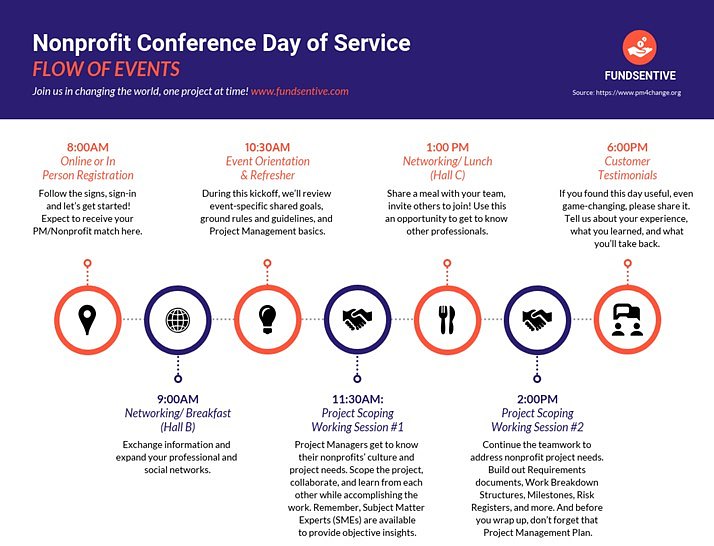
Even if you have a longer visual, break it up into smaller graphics. For example, a longer presentation can easily be divided into smaller sections, like this:
Source: Venngage
Insert those mini-infographics every 100-200 words to break the monotony of text and move readers down the page.
To create mini-infographics, follow a few design tips when using templates:
- Keep plenty of white space between elements.
- Don’t go overboard with color use; 2-3 colors are enough.
- Use color contrasts and relationships to build out a color scheme, explained in this video:
- Use a maximum of 2-3 fonts—and use readable fonts for the body.
- Keep elements aligned so the visual looks professional.
- Group elements according to hierarchy or similarities.
- Icons are your friends; they tell a story in an instant.
- Use branding elements, such as your logo, colors, and fonts.
Use those tips to design mini-infographics that make your pages more attractive to audiences. That’s how you can lower bounce rates and get your website to rank on Google.
What Kinds of Mini-Infographics Influence On-Page SEO Factors?
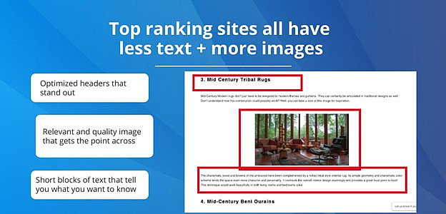
If you’ve seen infographics, they tend to be longer and larger visuals because they attempt to be comprehensive. But to improve on-page SEO optimization, you need shorter and smaller graphics.
Mini-infographics summarize key points. They work alongside text hierarchy—titles, headers, and subheadings—as follows:
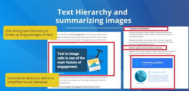
Source: Venngage
What does a content summary look like in action? Here’s an example of a mini-infographic that’s packed with information:
Source: Venngage
Note how the graphic is still short enough to give users a reason to stay on your page. Plus, it encourages them to click on your call-to-action button.
That graphic could easily have been a long page that users would have to scroll forever to get through. Instead, the mini-infographic gives them the information they need at a glance.
Charts, like the following example, tend to draw the eye of the user. The chart uses bold colors and fonts to get to the point. It’s easy to skim, and it gives the reader a break from just text.
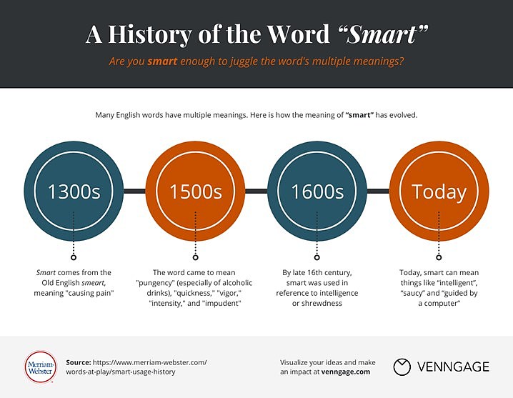
Source: Venngage
One more important point when you’re adding visuals like mini-infographics to your posts: Don’t forget about optimizing the images—particularly by adding alt-text, which can also help your website rank on a keyword.
Conduct On-Page SEO Analysis to Incorporate Mini-Infographics
I’ve shared why you should create mini-infographics for your new posts. But what about the existing content on your site? It’s time to do some on-page SEO analysis.
Use Google Analytics to study your bounce rates. What are the keywords for those pages? What’s the bounce rate and rank for pages with those keywords?
Not all pages will need a revamp. But if your bounce rates are higher than other pages on the same topic, those pages will need mini-infographics.
After updating a page with a high bounce rate, we found a huge drop in bounces:
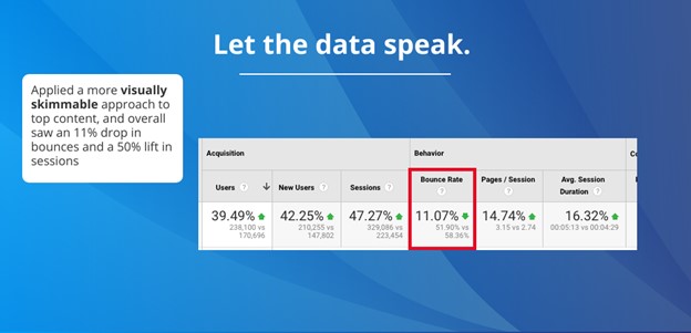
Source: Venngage
Now it’s your turn to experiment on your site. Update your text to be more skimmable. Use shorter sentences and more headings. Write a line summing up your points.
Then add visuals like mini-infographics and charts every few hundred words.
What I’ve suggested in this article may be a new method for you. But if you practice creating more graphics, you will get better at it.
And the result will be higher-ranking pages with lower bounce rates. That’s a win-win in any book
—
Guest Author: Nadya Khoja is the chief growth officer at Venngage, increasing its revenues from 6 figures to $10M. She hosts a Web series called Drunk Entrepreneurs, featuring interviews with entrepreneurs who are finding success.
LinkedIn: Nadya Khoja
Twitter: @NadyaKhoja
This article first appeared in www.marketingprofs.com
Seeking to build and grow your brand using the force of consumer insight, strategic foresight, creative disruption and technology prowess? Talk to us at +971 50 6254340 or engage@groupisd.com or visit www.groupisd.com/story